It can seem like there’s an ocean of platforms to cover when it comes to promoting your business. In the realm of social media alone you have Facebook, Twitter, Instagram, LinkedIn and more. You could explore using print, signage, promotional products, video and apps in your marketing toolkit- the possibilities are ever-growing. It’s easy to feel overwhelmed when keeping track of your presence and a firm grip on your identity.
A strong brand identity transcends looking as slick as your operation is. It’s important to be easily recognised, identifiable and trustworthy. Whether you’re the new kid on the block or you’re considering a re-brand, here’s a few reasons why establishing a good-looking brand can really give your business a boost.
The nature of your business should influence your brand’s look and feel. While this sounds obvious, it’s an easy pitfall to make. You wouldn’t use Comic Sans in your design if you were an accountancy firm, the same way corporate, serif fonts wouldn’t convey the right message if you were a nursery. As well as instilling credibility, the appropriate aesthetic will also be informative so people can instantly recognise what you’re about.
You’re here for a good time and a long time. Your business will (hopefully) be around for years to come so you should start as you mean to go on. Think about shaping a brand that will stand the test of time, utilising a back story to add authenticity and reassure your audience. 64% of consumers say that shared values help them create a trusted relationship with a brand so think about answering; ‘when did you start doing what you do, and why?’ and enrich your story with a mission, vision and values.
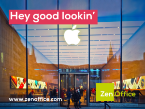
When it comes to design, a well-considered and tested logo will be very kind to you. Think about where it will be placed and against what mediums, something clean and simple with minimal colours will be the most versatile. Colour improves brand recognition by up to 80 percent and brand behemoths such as Coca-Cola, Starbucks and Apple’s two-tone use of colour in their logos shows that sometimes simplicity is best- who can’t recall all three logos from memory? Along with flexibility for positioning, with minimal colours comes lower print costs, too.
Once you have settled on your aesthetic, write it down, write everything down. Your brand guidelines will be invaluable to your business and it’s crucial that they are followed to the letter in order to maintain uniformity. From the placement of your logo on your invoices to your website font to the colour of your furniture, it all counts when consistent brand presentation across different platforms has shown to increase revenue by up to 23%.
We understand looks aren’t everything, but having a recognisable, effective brand really helps in an image-focused world. Our Print Specialists have a wealth of experience in working to brand guidelines and are always on hand to assist with best practice advice or quotes. Contact them today.

Customer Services: csnational@otgroupltd.co.uk
Customer Orders: orders@otgroupltd.co.uk
Remits: OTGroup-remits@otgroupltd.co.uk
Customer Services: 0330 165 4451
